
SA Psychotherapy & Counselling
Creating a human brand identity
The Challenge
Stuart Angell is a UKCP-registered psychotherapist who works with performers: actors, dancers, musicians and anyone whose life plays out in front of an audience. His sector was full of credible practices but less-than-inspiring. He needed a brand as considered as the conversations in his room.
The Idea
We all tell stories.
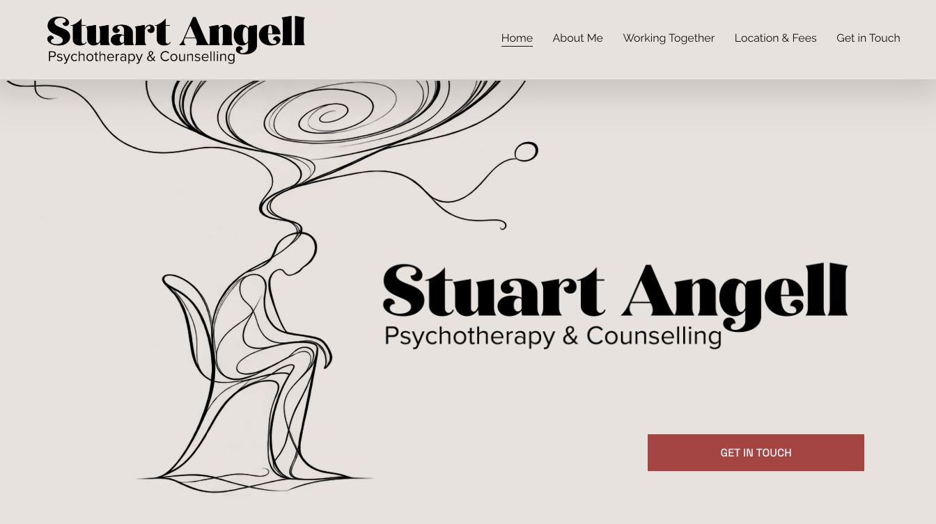
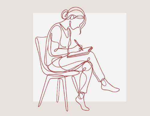
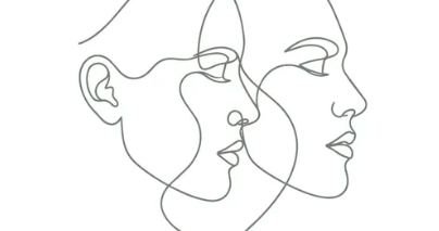
Everyone who walks through the door arrives mid-story. So we built the brand around a single line, drawn without lifting the pen. It loops, doubles back and keeps going, much like therapy itself. Even the double L in Angell took a small role, acting as a subtle mirror of itself.
The Work
A brand identity and website. Continuous-line illustrations in charcoal on off-white bring the hush of a gallery. An expressive serif plays the lead sparingly, a clean sans handles the supporting cast, and deep red accent grounds it. The human tone speaks to the audience directly, offering therapy for your off-stage persona.
The Impact
A brand that stands apart in a sector of lookalikes, and a site that feels like a (calm) front-row seat.
Live at stuartangelltherapy.co.uk